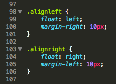
Below is a screenshot of some CSS code I stumbled on a few hours ago:

When I saw it, I just wanted to smack the nearest “hacker” with a keyboard.
Floating elements have text content wrapped around it and then alignment is to control the text direction for the whole element. So you float an image left or right and then have the text wrap around the image. Or you center align your text or left align it.
See better examples on CSS-Tricks: float and text-align.
This may be semantics but when you’re writing code other people are going to deal with, using proper and meaningful naming conventions can save them hours of time.


Add a comment
Post