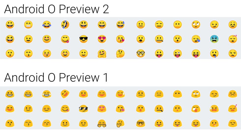
Gallery: All of Android O’s totally revamped emoji
One big surprise was the total overhaul of Android’s emoji. Nearly every emoji has been redrawn in a new style, and all of the yellow “blob” face designs are gone. The new emoji all get better 3D shading and generally end up with a design a lot closer to what you’d get on iOS. We have dutifully chronicled every new emoji in the gallery above.
I still think Apple’s are the best. The ones above look like they were done by teenagers and that’s pretty much doing that age group a disservice. Still better than the gumdrops for Preview 1 though.
Have a look at the current Face Blowing a Kiss emoji comparison for the various tech giants.
I cringe every time I use Facebook Messenger and see their emoji set in action. It’s horrible. They don’t even look round to me with that quarter moon orange shadow. And then the Firefox set remind me of babies.
Ya, I know…everybody’s a critic.


Add a comment
Post