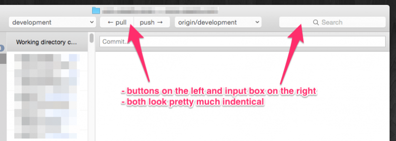
Overall, I’m not a huge fan of the toolbars across all apps in Yosemite.
Be nice if the buttons were at least a little different.
New to the site? Create an account →
 tcr!
· Oct 23, 2014 at 11:38 am

Overall, I’m not a huge fan of the toolbars across all apps in Yosemite.
Be nice if the buttons were at least a little different.
← Fortune Teller box just needs paint Oct 22nd, 2014 at 8:31:29 pm →
Jan 30, 2022 at 10:04 am
For years I have happily been giving Microsoft $69.99 a year for a 365…
Nov 2, 2021 at 5:41 pm
I don’t feel like “improves PDF scrolling” should be a selling point…
Add a comment
Post