I like the current design of tcrbang.com but after using it for the last three months I’ve come to the realization that it’s not near functional enough. Too much of something that I don’t like, maybe it’s the clicking.
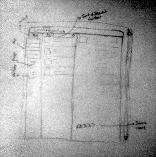
So I put pencil to paper and sketched out a preliminary drawing of a new “interface” since the goal of this is to make it more web-appy.

It’s a crappy photo, I know. My phone has a crappy camera so I don’t got that going for me. And no, it’s not a Twitter rip-off but rather a rip-off of a “vertical view” email client.
All my web developments start out with pencil and paper, then move to Photoshop and finally to HTML work. It’s much easier for me to get a good feel for the layout when I’m not pushing CSS pixels. Plus, I like the feel of paper and the smell of graphite.


I like it. Yeah that is a great way to start a design. Nothing like some graphite and paper.
Reply
Post
Definitely, computers aren't near organic enough.
Reply
Post